


all images via Living etc.

 I"m not sure what this says about me, but I think beautiful liquor bottles make a great home accessory. This portrait, along with its stocked tray of spirits, sets a certain mood. I can imagine someone asking for a Manhattan or a Rusty nail as they head off to an overstuffed chair by a roaring fire. My preference is for a bar to be set out on a table although there are wonderful bar cabinets available. I just think there is more visual interest as you can change the choice of liquor bottles and accompanying accoutrements with the season.

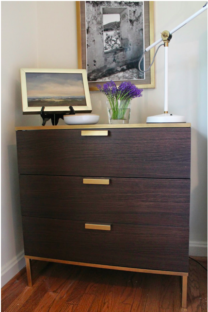
 Living etc, Jan 2008, Inside-Out chest, Fresh West Design
 Williams Sonoma Home Montmarte Cabinet
 Inside Avenue bar cabinet
And for those wine aficianodos - a vintage bottle holder.
 image via Beach Bungalow8
.jpg)

 I'm really pleased with the results. Our house is a 1950's ranch and except for a family room and office addition, the ceilings are 8 feet in height. As soon as the trim and wall were painted to match, the ceilings felt taller. So much so that I'm pondering painting the crown molding to match as a way of de-emphasizing it and also increasing the feeling of height. The crown molding is starting to feel out of place in this mid-century home. What do you think - should I paint the crown molding? Other thoughts on when it makes the best sense to have the wall and trim match?
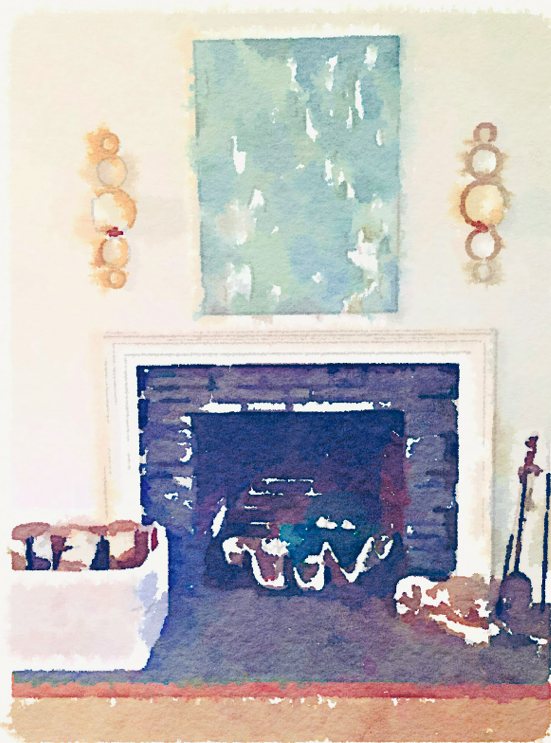
*part way through my "photo shoot" I took the sconces off the fireplace wall. It took a photo to make me realize I didn't like them anymore! Wall (and the hurricane lamps) are looking a bit bare...
For contemplation, here are some more rooms with matching wall and trim color.
House Beautiful, Robert Goodwin designer. Per interview by Christoper Petkanas: "Goodwin painted the trim in the entry the same color as the walls. He prefers this modern-looking treatment to the tradition of painting it in a contrasting color.".jpg)
Barbary Barry image via Alkemie


 The March 2008 issue of House Beautiful - saw it on the stands - had to have it right then eventhough one would be coming in the mail shortly! This is one of the best issues of HB. I had my concerns a couple of years back when things started getting stale and then, under the leadership of a new editor, they switched to the interview style format. But now I'm smitten. This issue is better than a huge hunk of dark chocolate!
.jpg)
 Designer Kathryn Ireland, photography Victoria Pearson


 Designer Angie Hranowsky has been featured on a number of blogs but I couldn't resist posting these images. The lush colors inpired me to be hopeful - Spring come around the corner soon!

 images from AngieHranoswky.com and House Beautiful, March 2007


.jpg)

.jpg)


.jpg)


.png)


