
 In my previous post I mentioned some of the changes made to my dining room in the last year but might have given the impression they were all improvements...I'm happy with some of the changes but definitely not the light fixture (!), along with a few other things.
From my perspective, the biggest challenges with my dining room are:
1) No window and no natural light
2) It's a must-walk-thru room to get to the family room beyond and the kitchen to the right
3) The room is only 10'ft wide x 13' 6" long
 Changes made so far that I like:
- Placing a table off to right side with a bench greatly improved the traffic flow in the room. We already owned the dining table, bench and chairs so they were just moved from other parts of the house. The seating works for our family of 4 and the round shape makes the bench easy to access. When guests come, we have five other matching chairs and a table leaf so we can seat up to 8.
- Changing the baseboards from 3 inches to 6 inches to match the family room addition (also replaced them in the living room and hallway)
- Moving the shutters to the family room as it feels more open and allows me to place the Wisteria demilune table in the room (no longer for sale - is the black finish too much?)
Changes I do not like:
- The light fixture!! I didn't want to reposition a chandelier/pendant off-center in the room and over the table as I thought that would magnify the placement of the table off to the one side. However, I think the light fixture I bought via the internet is ugly and does nothing for the room! The ceilings are 8 feet, and my husband is 6 ft 1" and my son is already close to that, so I really don't want something hanging down in this room.
- The plates aren't doing anything for the space. For that matter, there's no focal point in the room.
- Lack of cushion and pillows on the bench. This photo emphasizes to me how much orange is going on with the table and chairs. The cushions on the chairs are from Wisteria but they're no longer available. It's a white and caramel stripe on a blue/gray which I really like. I have one more cushion left and have wondered if I could use it combined with other fabric to make a bench cushion. Here's the blank wall across from the table. Don't you love the placement of the light switch and thermostat!
 Things I'm wondering about??:
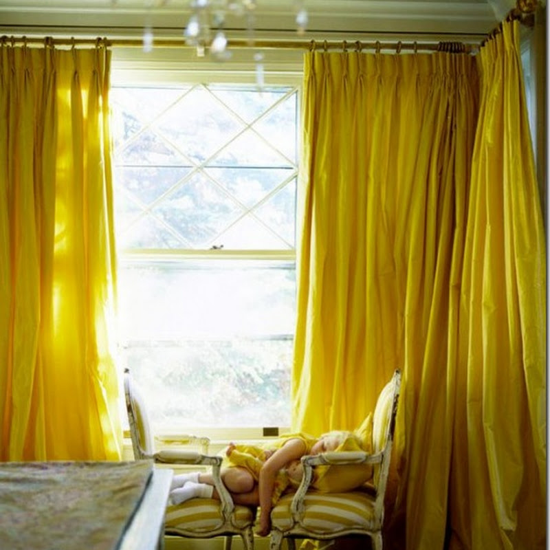
- Room Color: The yellow is Martha Stewart Yellowware and it's strong. My husband and kids like it, and I'm fine with it, but I'm wondering if the white wall below the chair rail looks dated?
I've thought of doing a stencil in a similar color over they yellow but I'm not sure I can live with pattern for the long term.
- Different Lighting - Is there a ceiling mounted light fixture out there that will look good or should I consider removing the overhead lighting all together and going with sconces only? Would this fixture work or would I be repeating the same mistake? (Laurie Smith Millennium collection - 18"square, 5" high)

- Artwork, Mirrors? - The wall behind the bench is pretty much on the same plane as the living room wall so I'm hesitant to hang just one painting over the bench as it seems like it will mimic the one painting over the fireplace. Would large scale antique mirrors on either side of the doorway to the family room work (something like the one below)? I wouldn't want to do regular mirrors as one will reflect the living room curtain and the other will reflect the outdoors as seen through the living room window.
 Ballard Designs Villaine Console mirror, 40"H X 30"W
 Here are two dining rooms that caught my eye. I like these wallpaper panels - they add interest and would be easy to change. (image from Canadian House and Home, photography by Andrew Grinton - for more pics go here )
 This is designer Victoria Neale's beautiful dining room from the recent CharityWorks GreenHouse. Makes me wonder if I could slipcover my bench to reduce the orange wood tones and add a more comfortable and finished feel to the room? (photography by my notting hill)
So, what do you think? I'd love to hear your advice and suggestions!
.jpg)

.jpg)


.png)


.jpg)


45 comments:
I like the lack of windows in your dining room - makes for a cozy, intimate space methinks.
One of the first things that sprang to mind was your need for walk through space - do you eat at this table every day, or do you eat in the kitchen (or elsewhere?).
If you do NOT eat in the dining room regularly, I think you could bring your table back to the center of the room if you weren't using chairs around it unless you were dining. Two of your chairs could go against the walls where the plates are, with the plates or other artwork above them (perhaps mirrors, depending on what they'd be reflecting). Then you could have the light fixture of your choice because it would be centered above the table (I like the pottery barn one, but it seemed in the photos to need to be lowered a smidge).
It's hard to tell about the chair rail, white paint below, yellow paint above - what's in the adjacent room that's open to it? I'm not entirely on board with the look you have being dated - though I've read that elsewhere recently. I'd leave it alone for now.
Welp, just goes to show that me and a box of rocks are equally as smart. I realize I just described the room you had before - with the chairs on the wall and the centered table, etc. Guess I liked it! Whoopsie. :D
Okay (I'm waiting for Modern Family to come on so forgive the multiple posts!)
I think you need another table, similarly scaled, opposite the demilune table, for symmetry. Since the table is to the right, I think symmetry elsewhere in the room will be important. Then perhaps on the wall opposite the table (the left wall), shelves (you can display the plates on them) to bring weight to that side of the room, but leave the floor bare for traffic?
MzMannerz - Hi. Our kitchen is a galley one so this is where we typically eat. We used to have a second dining space in the family room but now it's just for lounging/hanging out in. I so wished I had bought a second demilune table before Wisteria stopped carrying them!
Try a rug. It would help bring in other colors and patterns, plus it would define the dinning space and the walking/pass through space as separate. Go look, look, look at lighting stores or even ebay, see what is out there. Get more ideas but Yes - change the light! Also maybe add mirrors for more fake depth and light in the room.
having been in this room, i agree that it's difficult as it's also a hallway to much used parts of the house!
I think focus on making a focal point. The bench is a logical place so do something big above / behind it - i LOVE the idea of the wallpaper panels. The bigger the better!
Is it possible to get another demi-lune table to flank the doorway into the family room? Also - even if the views aren't the best, i think the mirrors would really open up that wall (again, the bigger the better!) - maybe even tall mirrors that went behind the demilunes down to the floor to open it up some, visually?
I like the yellow a lot -so cheerful and great for a family home :-)
The light fixture isn't beautiful -but I dont' think it's bad. The one you have shown here is pretty and would be an improvement -but in this space - the focal point won't be a chandelier as that's not practical -it has to be that bench and the wall behind it.
Good luck -I can't wait to see how it progresses!
Swag a chandelier over the table..like your pics... they are great!
Consider bookshelves on one wall for the dining/library look so the room gets double duty!
The first thing that stands out to me is how much the table/chairs match the floor. And also how lovely the black shows by the doorway to your living room. I would paint the table and chairs and bench black. But that's just me. Drives my husband crazy. Or, how about a rectangular rug that would fit under the table area but not extend out into the room too far to impede walk through? I'd swag a chandelier over to the table area. I'm envisioning something with lots of glass...not too dainty, but not too mechanical looking either. I love your idea of slipcovering the bench to add texture and color and coziness. (And then you wouldn't have to paint it black! ha!). I'm a full to overflowing kind of designer, so I'd get two tall, thin paintings for eacb side of the entry to the living room.... or can you find a matching black side table and put tall vases with "sticks" in them? The four plates could go above the living room entry doorway...or could go on either side of a colorful piece of artwork over the bench. LOVE the wall color...and the bench...no matter what color it ends up!
I really like the lay out of your dining room! I do believe a pendant would make the room pop even if is not one that hangs too low. Happy 2010!
For a lighting fixture I would still do a chandelier or pendant type light (I do love a Chinese inspired lantern) and place it in the center of the room, however, take the chain and bring it over to the side and attach it to a hook in the ceiling that is centered over the current position of your dining table. This way, for the future, if the table is centered in the room again, the placement in the ceiling will be correct. I would ALSO add sconces to either side of the room. Put them on dimmers definitely and go for something funky.
I really like the wallpaper hangings that you showed in the one picture. I would put this opposite the table though... not on the wall with the bench.
Placing mirrors on either side of the doorway is a little boring I think. I might consider a tall topiary type plant in a gorgeous grecian type pot. This would go well with your yellow walls.
I would also look for real linen textiles for your table and chairs. This organic feel and look is what is needed to juxtapose the bright yellow walls. Also, add some grenery in a pretty pot on your table to go with your topiaries!
Have fun!
Ooh, so fun! I think you're on the right track with the photos of the two rooms your posted and like the ideas of a rug and a slipcover for the bench to soften all the wood in the room. Also like AD's suggestion of the mirrors on either side of the doorway, creating symmetry, but maybe do mirrors with an arch top to offset all the rectangular shape in the room. Even though your husband and son are tall wouldn't you consider a chandelier type light fixture? It would really add to the space/focal point and you could "swag" it over the table as someone else suggested. Maybe you could some wallpaper under the chair rail, but understand what a commitment that is, so maybe not. I'm sure you'll get a lot of great suggestions here!
You are off to a great start. I think a chandelier swagged over like in the second inspiration photo would look good, definately add a cushion to the bench. A rug could add that punch you are looking for and really cozy it up. Have you seen this one http://www.laylagrayce.com/Products/Lacework-Blue-Hand-Tufted-Wool-Rug__CH13211.aspx by Amy Butler for her new line of rugs? It would look fab with those vintage linens you posted. Have fun. Smiles, LC
Here are my comments - for better or worse!
1. Swag a chandlier over the table; the brass fixture is too 80s.
2. Get an area rug - a tribal oriental would be great - with some red/orange in it for brightness; it would help anchor the area and make it more important.
3. I like the shutters - they add some texture; try adding fancy gold-framed mirrors to either side for contrast. Look for old frames or make your own; otherwise, you'll be looking for years and will have moved by the time you find a pair - I state this from experience!
4. Find some other fabrics for the chairs and settee, maybe linen which wears well and looks great and adds more texture.
5. Touches of red would add more visual interest even if it is not a color used in the rest of the house - the yellow/red thing is very English and cozy.
6. How about some ironwork - a rusty garden gate or two on that long wall? Real thing - no repros!
7. Also try framing fabric on stretchers (remember Marimekko?) for quick and cheap.
8. As for the bottom of chair rail, have you thought about a contrasting paler color? Find your rug first and take a color from that. It could really tie everything together.
Good luck and I so love your blog!
One more thing: check out this link to "Maison 21" (who is a hoot) about wallpaper inserts - hope it helps!
http://maison21.blogspot.com/2009/01/so-wong-its-right-finally-m21-talks.html
I really think that room would love some paper on those walls or at least that one back wall.
I would love to see some "height" variety- perhaps a bookshelf in brass with collections, and I think if it is not a room that you have dinner, why not make it a "library" sort of "lounge" - books - music - art go together so wonderfully.
I always love how you edit and pull it all together.
I would love to see a variety of lights too which add ambiance to a space. Small book shelf lights.
I know it will be transformed into something soothing and special.
pve
I love your taste, style and blog, I have gotten so many great ideas so first off, THANK YOU!
I think you should rethink the light fixture. SWAG it over the table, I love the lantern pic and also the one with the chand. swagged. You have the old chandelier, try it, you just need a longer chair and cord and a hook. I think it would more define your eating space, along with a couple of sconces above bench around some art or panels...Also, love the idea of making it a dual purpuse room...bookshelves, library feeling, great place to study or work too....Love Architects idea of mirrors behind demulines (don't think demulines have to match, do they, can you find one similar in scale)? Keep us posted!
Since you have to use your dining room as a hallway, embrace both of its uses. I see nothing wrong with swagging a fabulous chandelier over the off-center table. All of the previous suggestions to make the bench and wall behind it a focal point sound good. I think the shutters should come back ... the plates and demilune table don't have the weight necessary to hold down the far end of the room. Have you noticed that everything in this room is happening at or below chair rail height? The wall opposite the bench would be a great gallery wall. It sounds like you know what you want to do, you're just hesitant to do it. Go for it!
I LOVE yellow, but I definitely think you need a new paint color in this room - something lighter, less brash, more relaxing/romantic. Maybe a deep grey, chocolate brown, or soft neutral. And I agree that the furniture matches the floor too much. That can easily be fixed with a rug (check ikea or overstock for affordable options) to break it up OR by painting the seating. Unfortunately, I too prefer the way you used to have this room set up, but I understand the traffic flow problem. What about the pedestal table you used to have? Is that too large to bring back? And I had never heard the term swag - but that sounds like a great idea to bring the chandelier back into the space. I think the first thing to decide on is whether you want this room to be formal or casual. Because you went from a rather formal looking space to a very casual one. That might help make up your mind with where to go and what to change...
Can't wait to see what you decide!
Alaina
p.s. check overstock for lighting! they have so many affordable options
What about making this room into more of a library/dining area. Add bookshelves around the door, change the colors to warmer cozier colors and that includes all the woodwork then find a permanent place for the table chairs and bench and hang the light fixture. Maybe even paint the ceiling a darker/not white color keep the eye level and off the eye off center light. A big mirror with the plates surrounding the mirror would be a better presentation. I agree with you they are lost on the wall by the door. Add electricity in the bookshelves for some lamps so your only light source in that room is not the ceiling fixture. Also a big rug in the room too. Even though this is a main traffic area it doesn't need to be landing strip wide. Just my opinion. Good luck, I love challenges like this!
My humble thoughts would be to go ahead with a chandelier/hanging light swagged over your table. What about adding a sideboard/console table on the blank wall with some sort of art/mirror/etc. arrangement above and maybe even chairs on either side of that.
Would the board and batten treatment or judges paneling work for under the chair rail for a inexpensive change? I think the wall is fine as it is, but those are a thought.
Both inspiration pictures are beautiful. I love the fabric/wallpaper treatment too. Love the way the length in the first pictures goes lower than the bench. Could you utilize the shutters in the first picture in some way. I like how that wall looked with the shutters and chairs too.
I really enjoy your blog.
I like wainscoting in a dining room that otherwise doesn't have a lot of ways to break up the wall space. I like the mirror you've shown. I agree about the light fixture, if you can't center it over the table then I would remove it and do sconces instead.
You had me at the yellow though - love it!
Here's my 2 cents. I would never do a swag, it's always a distraction, especially on a lower ceiling. A possible solution would be to cut a new hole and try a large ceiling medallion to cover both holes. Move your thermo box any qualified electrician can do this and it will be worth it. They are often in the most obtrusive place. Based on the all the beautiful photos, I believe you are looking for softness. I love the Victoria Neale room, all of it except the chain swagged for the chandelier:) Good Luck!
I'm sorry, but I didn't have a chance to read all of the wonderful suggestions, but right away the first thing that hit me is that I felt that the table and chairs' feng shui was off and they should be on the OPPOSITE wall and the Wisteria console placed on the wall closer to the kitchen entrance. Just had to say it. I absolutely love your other inspiration photos. Isn't it hard when you have so much out there to choose from? Yikes. I sympathize.
I would get a new dramatic chandelier and center it over the dining table. Did you see the Chinoiserie lantern on Aesthetic Oiseau today for $120? I would blow up an etching like Lauren did on Pure Style Home for the wall over the bench. This would be a dramatic focal point. A monochrome Grisalle look. Then new cushions for the chairs and cushions and pillows for the bench. Or white linen slipcovers. I like the yellow walls. Would look great with white slipcovers and a gray toned etching.
I loved the wallpaper panel idea, and a rug would probably help.
I think you've already got a bunch of great ideas after reading some of the other comments. Here's my two cents:
1. Another demi-lune would look great to balance out that doorway. Wisteria doesn't carry it any longer you said...maybe two diff't tables??
2. Two long mirrors where the plates are to visually stretch the room and open it up.
3. I really don't like the lighting you have going on. I would def. swag a chandelier over to the table.
4. Add a oval or round rug under the table to warm up that area.
5. Wallpaper panels behind that bench would look KILLER! You could also add a piece of art over the panels for more depth.
6. Get some color on that bench and def. add cushions and make it cozy. It looks hard and uninviting right now.
By the way, the first pic you used in your post would be a WONDERFUL example of how you should set up your room! I think that's the way you should go for sure.
GOOD LUCK!
OK....I got a little obsessed with this room and all the wonderful suggestions. So....I did a little sketch, but can't find your email through your blog. If you email me, I will shoot it right over!
1) In a nutshell: a couple of etageres filled with books on either side of the doorway.
2) Move the table, bench and chiars to the other side of the room as another commentor suggested so you can get straight to the kitchen without having to go around the table.
3) The style of the table with the chairs and bench....not feeling it....but perhaps a table cloth? Burlap is sturdy and very inexpensive, esp. if you top with glass.
4) Love the large mirror idea...put above a skinny table where the bench is now. Couple of tall skinny lamps on the table for more light. Maybe a large basket trunk under the table.
5) I agree with the rug idea...perhaps seagrass, which really does wear well and is pertty inexpensive also.
6) Agree with swagging a lantern fixure over the table.
7) A group of framed prints above the bench on the thermostat wall.
Great space!! and lots of fun to think about.
Michele,
I have a similiar room in my house (the library you featured in your Ragland Hill post). It has been the bane of my existence until now, after I think 7 years, I'm finally am happy with it.
It, too, is an interior room, with doorways on three walls leading from Entry Hall, Kitchen & Sunroom (nightmare)! Major traffic patterns for kids, dogs, friends, family, me (I think I pass through that room at least 100 times a day).
Enough about me & all about you. Excellent move putting the table on the wall & out of the center. I think the other's ideas of making this more of a dining room/library is a fabulous idea. One of the most charming dining rooms I've had dinner in was one surrounded with bookcases.
I also finally like my Library because I just let it be a cozy interior space. I either read or someone told me that if you have an interior room with very little natural light, just let it be what it is, a cozy space that envelopes you. I do think this is really good advice because if there is one thing that is impossible to change it's the room location in your house. Whether you leave the yellow or not, I think you should carry the color below the chair rail and I even painted all my trim the same color as the walls to not have the busy of lots of trim, etc. A neutral might be better for the wall color and then add your fabulous wallpaper panels or something with interest.
Why don't you do small sconces around the perimeter of the room spaced appropriately with what else you plan to put on the walls creating a library type space.
No on a rug, too many people traveling through daily. I think it's really hard to determine what size rug would go in a walk through space as well.
I hope this helps. I can honestly tell you that after doing interior design for 10 years or more, this kind of room is the hardest to tackle.
I think you're on the right track. So feel your pain in figuring it out but once you do there is no better space to be in. Every party we have, guess where everybody ends up? In that tiny room, jammed full of so much stuff, glorious open spaces right, left and center and they're all piled up in there. Go figure.
Good luck! Can't wait to see what you come up with.
Gwen
Ragland Hill Social
Could you bring back the shutters? I think they really added another dimension as you looked through from the windowless room into the lighter room beyond...I think this room just needs some 'softening up' to make up for the lack of natural light..it could be really warm with some additional fabric, artwork, mirrors and definitely a different light - I would go for sconces AND a chandelier...Lots of houses here in the UK have very small rooms which don't look small with the addition of 'stuff' but cosy and intimate...I would be going for that look rather than trying to make it look more spacious....warm wishes & good luck with the re-doing! Susie
All this response is great - thanks so much everyone. You've given me some great ideas as well as got me rethinking some things - shutters, lighting!
Michele,
Thought I better clarify my orignial comment...I do think this space needs a chandelier, just not swagged. Sconces would also get my vote!
So glad you like that House & Home dining room shot! The bench and light fixture are amazing. Please feel free to hyperlink to http://bit.ly/4ap0B0 for even more inspiration photos.
I love the shade of yellow on your walls!
I never would have thought of wallpaper panels. What a good idea!
RoRomom - Thanks for the link - I've added it in.
one more vote for a hanging chandelier or lantern. if having your ceiling junction box moved by an electrician is out of the question, then a swag would be a better option then the current fixture, which emphasizes the room is a hallway first, dining room second. you want that the other way around!
i think one of the problems is the table and chair set. to my eye, placing a round table off center isn't very appealing, given that the room is long; an oval would feel more finished and appropriate to the shape of the room. also, you have a lot of contrast between wall color and the white wainscoting, and then a whole bunch of brown wood (table, chairs, bench floor) in the middle. i think contrast between table and chairs would really help too, so your idea of a slip on the bench is a great start, but i'd do slip covered chairs too- ballard sells inexpensive slip covered parson's chairs. i would recommend against putting silps over your existing chairs, as the backs aren't plain and upright enough, and the slips would always look ill fitting, even if they were custom made.
i'd hold off on the baseboards- that sounds like a lot of money for very little impact, and the funds could be used to more dramatic effect, elsewhere.
last, yes, stuff on the walls. anything! ;-)
good luck- there is lots of great advice on this thread!
I've really enjoyed reading all of the great suggestions you have received about your dinding room. I have a room that has very similar issues and your two inspiration photos have also been two of my favorites as well. If you get a chance to check out my blog I would love to hear what you think about my space(kansasfarmhouse.blogspot.com).
I really liked a lot of Katiedid's suggestions. I really like the idea of a table skirt. If money were no object I would just get a whole new bench. I think the wallpaper panels are a great idea.
These are just my thoughts and I'm not a designer but I do love interior design. I also think you do a great job without help.
Have you thought about painting out your table, chairs and bench? High gloss black would look awesome!
Thanks for the wallpaper panels inspiration! I just did framed wallpaper as pieces of art but the panels are an excellent idea!
I have thought a great deal about your room. First, I would bring the shutters back. I would also choose a "cool" color to replace the yellow, perhaps some shade of green or blue that may be in an adjoining room. You need more contrast with the orange/brown furniture and floors. I would choose one or two shades lighter on the same card for the wainscot. A rug would be great, a square rug would be best. I like the bench very much, and would not slipcover it. Instead, choose a very simple linen stripe (or something equally subtle) for the chair cushions. Then cushion the bench in a solid with a contrasting welt using the same colors as the chair fabric. Add a bolster across the bench back, but leave it "low". Omit back cushions for the chairs. All upholstery should be slightly plump--not too tailored. The light fixture presents the biggest dilemma. I personally think that if you decide to swag it, you should use some kind of ethnic cloth shade or a two-tiered drum shade. Finally I would get some interesting metal finishes into the room, perhaps with the sconces. If you can afford it, I think treating these as art pieces would add great personality to the room. I'd spend money on handcrafting here because it would be so close to eye level. You also need a wonderful mirror to reflect light and enlarge the room. This could hang between the sconces on the far left wall. I know that your room will be beautiful and can't wait to see the finished product.
I love one reader's idea of making the dining room a library/dining room. And definitely repaint for coziness. I'm not sure about the chair rail. (I have one in my dining room too!) Maybe with a cozier color and no white it will not look so kitcheny.
I also vote for a swagged chandelier--and maybe some demilune tables flanking the doorway.
These are just off the top ideas. I think you are on the right track with the off center table and using the bench.
I agree with the notion of removing the ceiling light fixture. The one you have now makes the room look like a hallway with a table. Use the bench wall as a focal point by hanging something special and rather large above it and either a pad or pillows to soften the look. I do not know what the traffic pattern is like but leave the table in the middle of the room - if possible - hang a lantern or hanging light of some sort. Put the chairs that impede the traffic pattern around the room. If you have bookcases along the wall to the family room and make the room a library/dining room it will become more of a destination and feel less like a hallway. Chairs could go in fount of the bookcases - they would not look like lost souls that way.
Thanks for sharing this great article! That is very interesting Smile I love reading and I am always searching for informative information like this.
Indonesia Furniture Handicraft Wholesale Marketplace
Dining room is an important section of your house. This is the place you will spend time eating and also having real conversations over food. So make sure your dining room is cozy and welcoming. Dining room furniture ranges from simple to stately. Depending upon the theme of your dining area, you may purchase a formal or relaxed dining room set.
wow account
Post a Comment