Friday, January 29, 2010

A Reader's Home & Treasure of Landscape and Chinoiserie Murals

This is the kind of email that for me, as a blogger, is so exciting to receive. In response to my recent post on windowless dining rooms, I was contacted by a reader about the landscape scenes painted in her historic Woodstock, VA home built in 1796. Winnie, the homeowner, commissioned artist Virginia Jacobs McLaughlin of Frederick, MD to paint a Shenandoah Valley inspired landscape wrap-around mural in her dining room. Absolutely stunning!!
Now in her 80's, this talented artist has been painting for the last 50 years and her work is featured at the Mount Vernon Inn, Brafferton Inn, Grand Army of the Republic Building in Gettysburg, Defense Acquisitions University and numerous other public buildings and private homes. This includes the 1750 Julia Etchison-Hannah house in Frederick, MD, of which an author noted the following about the dining room mural; "To say that Virginia McLaughlin's mural ably captures Frederick County during the Civil Was is to damn with faint praise. The mural is quite magnificent, providing a sweeping panorama of the great landmarks, moments, and key players." (complete article, go here. author unknown)
In an article by Greg Caruth of DUA Press he notes, "Her painting style is full of personality and incorporates the styles of Moses Eaton and Rufus Porter, and includes hints of the famous French scenic wallpapers by Zuber et Cie...She paints boldy and directly on the wall with little or no preliminary drawing. She consults photos and drawings from many sources, but as she explains, the finished wall is sketched in her mind before she starts painting." (full article here)
Winnie mentioned that it was Virginia who strongly urged her that a Chinoiserie landscape scene would be the best choice for the front parlor. Yes, absolutely the best choice! Love this.
An interesting note about Winnie's home is that the original plat was laid out by a young surveyor named George Washington. If you would like to see even more close-up photos of Virginia's work in this home, which is now for sale, go HERE
Virginia does not have an email or website, but if you're interested in contacting her, send me an email and I will forward her number. I think having Virginia's painting in your home would be something to treasure. mynottinghill ( at ) gmail (dot) com.

Monday, January 25, 2010

Solution for a Windowless Dining Room

Earlier in the month I had wrote about my dilemma in decorating my small, windowless dining room that now functions more as a pass-thru than a dining room. I received so many terrific ideas comments - thank you. Prompted by a suggestion from Beth of Chinoiserie Chic, I've been giving alot of thought lately to the power of scenic wallpaper to visually expand a windowless space. Recently I came across this windowless dining room designed by Laura McLaughlin - you can see it just beyond the couch.
The misty English landscape was painted by Boston area artist Patricia Trapp. I'm not sure I would like to make that type of commitment, but I'm wondering about a landscape scene in muted tones or grisaille painted on, or applied to, an oversized canvas. Being a bit fickle, the trick will be in finding something we won't tire of and appeals to us personally, like the country side of the Finger Lakes in NY or Co.Kerry, Ireland.

Also, thanks to your comments, the bench has been moved out of my dining room and the table is now centered in the room. Instantly, the room felt more balanced. Now instead of 44 inches of space to walk by on the left, there's 39 inches on both sides of the table. This also solves the lighting problem and now I'll plan to go with a chandelier/hanging fixture.

For more pictures of this beautiful home, originally published in Traditional Home Nov 2005, go here. (Photography by Frances Janisch)
For additional ideas on scenic papers, SW Design has a very comprehensive post here.

Sunday, January 24, 2010

Jennifer Sergent's DC by Design!

I was a big fan of Jennifer Sergent's work as Senior Editor at the recently closed Washington Spaces and am so happy to hear she has launched DC by Design! Love Jennifer's description - "I'm a design writer and blogger, recovering from almost 20 years in mainstream journalism..."

DC needs dedicated coverage of talented local designers and knowing the quality of her work, DC by Design is going to be a terrific go-to source for anyone seeking up-to-date info on the design scene in the Washington, DC area.

Having been self-employed for the last 15 years, I'm always inspired when someone launches out on their own to pursue their passion. Congratulations to Jennifer - I have a hunch 2010 is going to be a great year!


First up, Jennifer has some great photos of a new project by DC designer Sally Steponkus. As usual, Sally's interiors are gorgeous - go here to see more. (photography by Annie Seckinger)
There's also a scoop on the designers named for the upcoming 2010 DC Design House in the 10,000 square foot Chevy Chase Beaux Art mansion that was once the site for the Harry S. Truman inaugural party. Jennifer will be covering the Bare Bones Tour on Feb, 27 - which I was dying to go to but am going to be in St. John USVI that week. You know I'll be trying to hunt down internet access somewhere on the island to take a peek at the pics. Go here for more and the listing of designers.

Thursday, January 21, 2010

Big Window Challenge = Eddie Ross Room Love

Hip, layered and fearless, Eddie Ross's design for Elle Decor's entry in the Big Window Challenge is a joyful celebration of the power of a room to make you feel happy and optimistic! Why play it safe when you can envelop a room in a vibrant blue splattered print and ground it with beautiful blue ceilings, moldings and faux bois floors. Echoing Elle Decor's panache for classic design with signature flair, Eddie's elegant room would be the perfect backdrop for a lively cocktail party or a quiet night at home.
Clean lined, upholstered furniture balance curved, vintage pieces that are warmed up with gilded bronze metal finishes. Love, love the chandelier.Shoes off + a pile of magazines + a blanket = Eddie's got my number!
The room is filled with original twists - check out these oversized pink patterned oval pillows.
If you read this blog, you know I'm a big fan of Eddie Ross. I'm also a big fan of this room and hope you'll take the time to check out Bloomingdale's Big Window Challenge HERE and cast your vote. You can vote through January 28th. Hope you'll join me in voting for the Eddie Ross room!

Images above: Addie Juell (via La Dolce Vita)

Image source Kristy May

Fireplaces in Kitchens

If I was building a dream house, a fireplace in the kitchen would be near the top of my wish list. This kitchen of Canadian designer Brian Gluckstein is my all time favorite. I love the elevated placement of the fireplace surrounded by the beautiful dark wood cabinets and woodwork. Off the the left, not shown, is a gorgeous banquet seating area (more on that in a later post) Source: Canadian House and Home, Feb 2003, photography by Michael Alberstat
Here's another beautiful, traditional fireplace adding ambiance to the kitchen of this older home. Imagine Sunday breakfast here. (photography by Mark Walron, Southern Accents, via All the Best)
The fireplace stands out in this blue kitchen in a Notting Hill home that was for sale last year. If it was lit I think it would give a better sense of its impact in the room.
Do you have a fireplace in your kitchen? If you do, I'd love you to send me a picture so I could so a second post. mynottinghill ( at ) gmail . com

Tuesday, January 19, 2010

I Spy: Coincidence or Styling?

Leafing through the March issue of Traditional Home, I noticed these light blue bottles in the room designed by Ruthie Sommers. Pretty and fresh, I think they look great as part of the tablescape. (photography by Grey Crawford)
Ten pages later I noticed the same light blue vases on the mantle of this room designed by interior designer Mark Williams. They look great there too, contrasted against the white walls and fitting in with the light, casual decor of the room.
(photography by Michael Garland)
In the source guide it appears that they're from Hollyhock. So it makes me wonder, is this a coincidence or a styling addition for the photo shoot? Either way, they look great in both rooms.
Additional thought - In the scheme of things that are going on in the world today, this really doesn't matter, does it?

Sunday, January 17, 2010

Traditional Home Honors Paul Corrie & Chance to Win A Room Design


D.C. designer Paul Corrie has been named as one of Traditional Home's 20 Young Designers to Watch. Paul was also one of two designer's to be cited in the opening paragraph of the article, "...to the neutral but nuanced urban interiors of Washington, D.C.'s Paul Corrie..." Congratulations to Paul for this well deserved honor!

I featured Paul's work in my DC Designer Series a year ago (here) and am excited to see that Traditonal Home is holding a contest allowing readers to vote for their favorite designer. The designer who receives the highest number of Readers’ Choice votes will provide a personalized room design incorporating luxurious Duralee fabrics for drapery, sofa, pillows and more (up to a $5,000.00 retail value) to a randomly selected winner. My vote's for Paul - go HERE to cast your own vote and for a chance to win the prize.


All images from Paul Corrie's website.

Friday, January 15, 2010

New Design Books (to me at least)

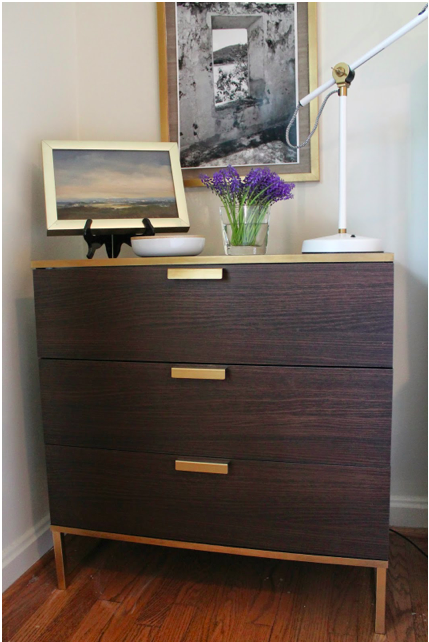
Always on the look out for design books I haven't seen before, I've added two to my collection that I really like - Dream Homes and More Dream Homes. Written by Andreas von Einsiedel and Johanna Thornycraft, each book contains over 800 photographs of interiors, mostly from Europe. A far range of styles are featured, from classic, eclectic, country, contemporary and opulent, so as long as you're not wedded to one aesthetic you're likely to find many interiors that appeal to you. The photos in this post are ones I've taken from the first book, Dream Homes. All photography by Andreas von Einsiedel. They also have a new book coming out, Dream Rooms, release date not published yet.


Thursday, January 14, 2010

Charlotte's Call to Design Bloggers & Readers

Today Charlotte Moss made a pledge of $10,000 to help UNICEF help the children of Haiti. Recognizing the power of design blog readers to make a difference, Charlotte also sent out a call urging bloggers to send out the word. It is her hope that her contributions will be matched and exceeded by others in the design world.

To read more of Charlotte's efforts go HERE to her personal post and to follow the link to UNICEF.

Wednesday, January 13, 2010

Mixing Faux & Real Flowers: Would you?

I know mixing real and faux flowers isn't something new, but I've never tried it myself. Above is a bouquet from Christmas, showing it's age.
I had these faux white crocuses, early signs of spring. So I mixed them in with the fading red roses I could salvage.
What do you think? I thought just O.K. Not sure I'm a fan of mixing just two colors.
Here are the same white faux crocuses mixed with left-over white roses from another arrangement. I like this better than the previous one. However, I think both the bouquets could have benefited from cutting some greenery from a backyard bush and adding that in.
Of course, real flowers have no true replacement. Although, I do like the idea of extending the life of a bouquet by mixing in some faux flowers. What do you think? Have you done it before or would you?

Sunday, January 10, 2010

Come in From the Cold: Dark, Cozy & Glam

A library, a fully stocked bar cart and a comfortable chair = perfect antidote to freezing cold weather. Love the dark wood and gold tones. (image from Canadian House & Home, photography by Ted Yarwood)

Designer Timothy Mather, Canadian House & Home, photography by Ted Yarwood

Isn't the candelabra in this powder room a great touch? For me, the sink and faucet are an unexpected pairing that work beautifully together.
(image from Canadian House & Home May 2008, design by Murakami Design, photography by Ted Yarwood)

Friday, January 8, 2010

Loving these & Thank You's!

Love a grocery store that provides seating near their magazine rack! Last night while at Harris Teeter I had a chance to browse magazines while waiting for my daughter's ballet class to be over. I think I came across this furniture from Bardin Paloma while looking through AD. Love it!
These stools reminded me of ones I saw on Canadian House & Home.
Speaking of which, thank you to Canadian House & Home for adding my blog to their blog list. I'm thrilled as I've been a subscriber for 10 years! In addition to great weekly web tv episodes, their talented editors and designers write 9 blogs - check them out here. The above pic of the side tables is from Michael Penney's Affordable Style - he found these at Value Village and plans to transform them into stools.
Also - THANK YOU so much for all the great comments and suggestions on my dining room dilemma. It's got me thinking about all kinds of things! I'll keep you posted. Have a great weekend.

Wednesday, January 6, 2010

My Dining Room Today...

In my previous post I mentioned some of the changes made to my dining room in the last year but might have given the impression they were all improvements...I'm happy with some of the changes but definitely not the light fixture (!), along with a few other things.

From my perspective, the biggest challenges with my dining room are:

1) No window and no natural light
2) It's a must-walk-thru room to get to the family room beyond and the kitchen to the right
3) The room is only 10'ft wide x 13' 6" long

Changes made so far that I like:
- Placing a table off to right side with a bench greatly improved the traffic flow in the room. We already owned the dining table, bench and chairs so they were just moved from other parts of the house. The seating works for our family of 4 and the round shape makes the bench easy to access. When guests come, we have five other matching chairs and a table leaf so we can seat up to 8.
- Changing the baseboards from 3 inches to 6 inches to match the family room addition (also replaced them in the living room and hallway)
- Moving the shutters to the family room as it feels more open and allows me to place the Wisteria demilune table in the room (no longer for sale - is the black finish too much?)


Changes I do not like:

- The light fixture!! I didn't want to reposition a chandelier/pendant off-center in the room and over the table as I thought that would magnify the placement of the table off to the one side. However, I think the light fixture I bought via the internet is ugly and does nothing for the room! The ceilings are 8 feet, and my husband is 6 ft 1" and my son is already close to that, so I really don't want something hanging down in this room.


- The plates aren't doing anything for the space. For that matter, there's no focal point in the room.

- Lack of cushion and pillows on the bench. This photo emphasizes to me how much orange is going on with the table and chairs. The cushions on the chairs are from Wisteria but they're no longer available. It's a white and caramel stripe on a blue/gray which I really like. I have one more cushion left and have wondered if I could use it combined with other fabric to make a bench cushion. Here's the blank wall across from the table. Don't you love the placement of the light switch and thermostat!
Things I'm wondering about??:

- Room Color: The yellow is Martha Stewart Yellowware and it's strong. My husband and kids like it, and I'm fine with it, but I'm wondering if the white wall below the chair rail looks dated?
I've thought of doing a stencil in a similar color over they yellow but I'm not sure I can live with pattern for the long term.


- Different Lighting - Is there a ceiling mounted light fixture out there that will look good or should I consider removing the overhead lighting all together and going with sconces only? Would this fixture work or would I be repeating the same mistake? (Laurie Smith Millennium collection - 18"square, 5" high)


- Artwork, Mirrors? - The wall behind the bench is pretty much on the same plane as the living room wall so I'm hesitant to hang just one painting over the bench as it seems like it will mimic the one painting over the fireplace. Would large scale antique mirrors on either side of the doorway to the family room work (something like the one below)? I wouldn't want to do regular mirrors as one will reflect the living room curtain and the other will reflect the outdoors as seen through the living room window.
Ballard Designs Villaine Console mirror, 40"H X 30"W

Here are two dining rooms that caught my eye. I like these wallpaper panels - they add interest and would be easy to change. (image from Canadian House and Home, photography by Andrew Grinton - for more pics go here )
This is designer Victoria Neale's beautiful dining room from the recent CharityWorks GreenHouse. Makes me wonder if I could slipcover my bench to reduce the orange wood tones and add a more comfortable and finished feel to the room? (photography by my notting hill)

So, what do you think? I'd love to hear your advice and suggestions!

LinkWithin

Related Posts with Thumbnails