Friday, April 29, 2011

A Royal Wedding Party!

My lovely friend Anne, a lifelong follower of the royal family, hosted the most wonderful wedding party this morning. Gathering at 5 am, we enjoyed a breakfast of scones, tea, strawberries and a bit of champagne, as we watched together. Anne's friend, whose husband recently returned from London, brought back charming wedding commemoratives. Pictured here though, is a Claudia Pearson tea towel. Absolutely love this all in blue!
Beautiful flowers...
Anne's exquisitely monogrammed linen...
lovely tea cups...
a just-installed Julie Neill Beatrice 2 chandelier, reminiscent of a crown and...
a lifelong collection of books on Princess Diana created the most wonderful atmosphere for our memorable time together. Thank you Anne!
p.s. Wasn't her wedding dress simply perfect!

Wednesday, April 27, 2011

I Spy

I was at Pottery Barn and saw something that reminded me of this framed map.
They've come out with candles which are an exact match.
My version of the map happens to be page torn from India Hick's book, Island Living. I've never been able to find a reprint in a larger size.

Monday, April 25, 2011

17th Century Kitchen Sink

A 2007 addition to this historic circa 1810 Charleston home includes a 17th century marble sink. Love the width and the amazing wall mounted faucets. It all looks better for being paired with a Ceasarstone island edged to look like a thick slab and lucite stools.
All images from Carriage House Properties here. Hope you had a great weekend. I'm sitting here wishing it was still Saturday!

Wednesday, April 20, 2011

Outside at the DC Design House

The DC Design House is open through May 8th and in addition to beautiful interiors, the landscaping and exteriors are also a source of inspiration. The grounds of this home are significant and Scott Brinitzer of Scott Brinitzer Design Associates used a repeating theme of curving pea gravel beds to bring a classic and refined look to the gardens and koi pond.


Jeff Potter of J & G Landscape Design revived the Hollywood size pool, including an elevated dance floor (not pictured here), and added select plantings to create an enclosed, private feel.
James Rill of Rill Architects, PC did a beautiful job treating the Exterior Front Portico with the same level of attention given to interior spaces. A thoughtful selection of paint subtly highlights the original Tudor Style architecture.
This image by Leah Moss of Apartment Therapy
Exterior Paint: Farrow & Ball Mouse's Back, Stony Ground, Mahogany

Monday, April 18, 2011

In Lieu of Southern Accents: This Charleston Home

I should have titled this post In Lieu of Taxes...as instead of completing my tax return I've been searching Charleston homes. However, it was very exciting to come across this home for sale and to recognize the kitchen that appeared in Southern Accents Nov/Dec 2004. I've always loved this space and have included it in posts about fireplaces in kitchens.
Does anyone know who the designer is? Update: Thanks to Midwest Snob and Kansas Farmhouse for letting me know the Southern Accents issue date and that the designers are husband and wife architects Mark and Melissa Marescu.
Would love to write more about my thoughts on this beautiful home but my taxes await...


To see more of this home, including the gardens, go here. (All images via Carriage Properties)

Thursday, April 14, 2011

Real Life ≠ Photography: Tips from Eddie Ross

Translating the look and feel of a room into a photograph is more than capturing the room as it is. As Eddie Ross pointed out in his talk Tuesday at the DC Design Center, real life does great interior design photography. In addition to styling, it's essential to move furniture and change the placement of accessories in order to translate the look of the room into a photograph that does it justice. Instead of trying to capture the whole room, focus on the "moments' - the shot of the fireplace, the corner with the secretary, the seating area. Help the viewer see the room as if they were in it. As Eddie mentioned, when rooms are professionally photographed furniture is rearranged to make the most of it. Don't think literally - think of the experience.

Style to Tell a Cohesive Story
In addition to ideas for capturing the look and feel of a room, Eddie shared numerous great tips in his signature funny and so-real way. While showing a photo of a kitchen that had been styled in a manic moment with cut watermelon, lemons ready to be squeezed, bunches of lavender, grilled zucchini, etc, he noted, "Check out the berries sitting next to the raw shrimp in the sink, if that's not a recipe for a food borne illness..." (there was a lot of fun and laughter throughout the presentation) Better to style a kitchen simply with a cohesive concept, such as a breakfast, so the styling adds to the design, not detracts from it.
Styling with a Season in Mind

If you're a designer, keep in mind that clients will look through your portfolio throughout the year. Do your rooms read a range of seasons or just one? Styling can help place the season of the room for the viewer. In the first photo, Eddie's choice of blue throw, pillow and flowers feels like spring. A change to an orange accents brings a warm, fall feel. In the last photo, a cream throw and pillow creates a whole new look - escaping the heat in August.

More Styling & Photography Tips:

General:
- Don't skimp on flowers and try to use unusual ones.
- Open doors and windows to bring in life.
- When styling an etagere or shelf, don't place objects as if they're for sale at a store.
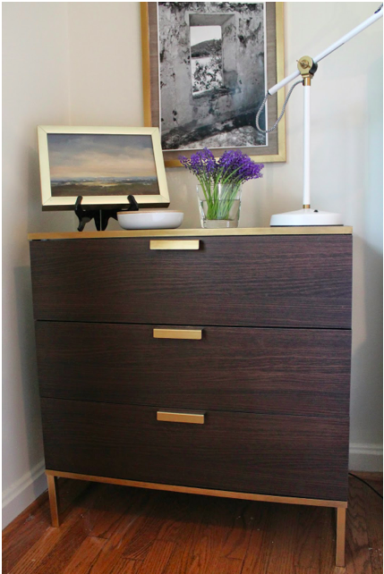
- Pull chairs out from tables so they look like they're really being used.
- Notice what's reflected in the mirror. Move things if you need to to make the reflection add, not detract, from the shot.

Bedrooms:
- Put clear plastic packing tape on the back side of pillow sham flanges to keep them upright.
- Avoid photographing a king size bed straight on. Choose an angle to capture the look.
- Is the bedside table leggy, with a vacant space underneath? Consider a stack of books or pulling up a chair.
- To keep the perspective right in the photograph, pull the second bedside table mid-way. It will look correct in the photo even though they're "out of place" for real life.

Dining Rooms:
- Instead of setting a complete table, consider stacking the plates and grouping the flatware together as if you're getting ready to set the table.
- Be careful not to photograph directly at table height when it's set with plates. They'll end up looking like weird saucers.
- To show off a beautifully set table, take the shot angled over the table.
- Don't burn candles in a shot that's clearly day time; it will have an out of place feel to it.

Hallways:

- If you're shooting down a hallway with a console with 2 lamps, you'll need to pull the second lamp out so it's not blocked by the other.

Living Rooms:

- Don't face pillows perfectly, make them look real.
- Notice furniture placement. A coffee table too close to a sofa will show up and seem strange.
- Bring in accessories - change out the ones that don't pop on camera.
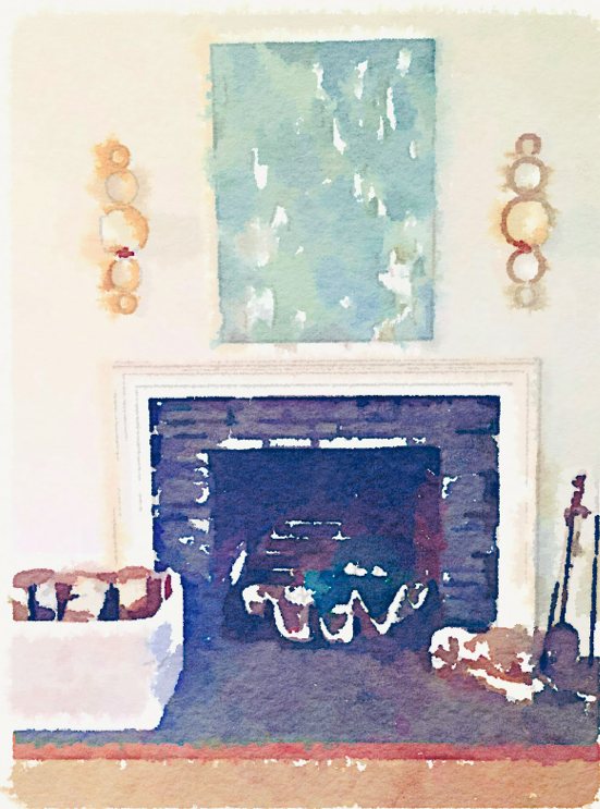
- Watch out for furniture or objects that block the great views, such as a fireplace. If an ottoman works in real life in front of the fireplace but not in the photo, move it out.

Bathrooms
- Don't overdo the styling. Eddie had us laughing with a magazine photo of a powder room with scented candles, and an air diffuser. Plus its waste basket was actually full of trash!
- Style the tub in way that makes sense (towel, chair to rest it on, etc) Skip the three trays of perfume bottles you'd have to climb over to get into the tub.

Hope you've found Eddie's tips helpful. It was a terrific talk & a great fun seeing Eddie and Jaithan in DC. If you ever have a chance to attend one of their events, definitely go.

Tuesday, April 12, 2011

Ripped Never Looked So Good

This pair of Louisa Settees with "ripped" strips of fabric caught my eye in the dressing room of Atlanta's Anthropologie. They're available for $2498 but don't you think this could be a DIY possibility? They're really stunning in person and looked amazing on the light wood floors.

Monday, April 11, 2011

Peachtree Battle Antiques & Capital Design Days

A classic combination - urns, shells and in the case of the first one, a shed antler or two. This eye candy is from Feb when I visited Peachtree Battle Antiques in Atlanta. Recently opened in Jan, 50+ dealers show a range of accessories and furniture. Definitely worth a visit.

If you're in DC this week enjoying the cherry blossoms, The Washington Design Center is hosting Captial Design Days April 12 - 14. Almost every program is open to consumers on the 14th, including a presentation from designers of this year’s DC Design House (Patrick Sutton, Liz Levin, Erin Paige Pitts, Lauren Liess and Nadia Subaran) who will share their inspirations and approach to their show house designs. For more info on all the events go here.

Friday, April 8, 2011

Upstairs at the 2011 DC Design House: Color & Texture

Designer Lauren Liess's debut, The Hideaway, in the DC Design House is a huge success! Texture, warmth and unique and interesting accessories create the perfect place to relax, and yes, hideaway. Here is Lauren seated in her own chair design, the Mad Hatter, with curtains in Happikat by Lauren Liess Textiles.
The focal point of the room is an expansive Princess & The Pea stacked mattress window seat. Piles of books and a tea set make you feel like you've stepped into a real room, not just a show house space.
Fabrics in the window seat include Lauren Liess Textiles and Peter Dunham. The floral on the back of the Mad Hatter chairs is by Jasper Michael Smith.

Lauren collaborated with local lighting artist Rick Singleton who designed and created this amazing floor lamp.
The quality of the details and finish is outstanding and it's a perfect, custom piece for this room.

Artist Matthew Moore painted a stunning grisaille boxwood garden that beautifully commands the space behind the concrete Parsons desk with an inspirational view. I love how Lauren placed the desk off-center from the painting. Antique chair from John Rosselli Antiques.

Paint colors: Churlish Green, Dimity Grasscloth by Seabrook
Designer Iantha Carley's masterfully executes strong color in an elegant and refined way in her Master Bedroom and Dressing Room. David Hick's geometric print in green starts off this fresh and crisp palette that includes florals fabrics as well.

Who wouldn't be thrilled to get up each morning to this amazing dressing room wrapped in this happy, colorful Nina Campbell wallpaper. The mirrored Parsons Table is a custom design by Iantha.
The perfect print for this space from artist Anne Harwell of Annechovie.
Attention to detail is everywhere including these AMAZING light switches from Forbes and Lomax. I covet these!

Paint colors: Charleson Gray, Stron White, Dragged Wallpaper, Nina Campbell wallpaper
The view from the master bedroom to the Master Bath by Allie Mann of Case Design/Remodeling. Allie did a beautiful job creating a seamless flow between the two rooms. Love the way she hung these three prints.
Paint colors: Cornforth White, Strong White
David Mitchell's One for the Guys bedroom is another standout. A mix of traditional and industrial pieces of varying finishes create a comfortable, hip atmosphere. Eight foot ceilings are elevated with David's choice to paint both the walls and ceiling in Farrow & Ball's Pavilion Gray.
Vintage prints of birds wrap around the space and add dimension in a room with simple architectural details. The shot I'm missing is the far window wall where a large, rustic table and industrial piece create an area for writing.
A practical, narrow bench paired with sneakers in the perfect range of colors for this room!

The DC Design House, benefiting Children's National Medical Center, opens tomorrow and runs through May 8th. Even though I've posted a lot of images this week - there is so much more to see!

Next week - images from the Exterior and Gardens.

LinkWithin

Related Posts with Thumbnails