
Southern Accents, designer Suzanne Kasler, photography by Trio Giovan

Southern Accents, designer Jenny Peters, photography by Tria Giovan

D Home, designer Julio Quinones - love the bench & cafe table in this kitchen

image via
Desire to Inspire  Design,Inc
. season one, designer Sarah Richardson

Image via Cottage Living

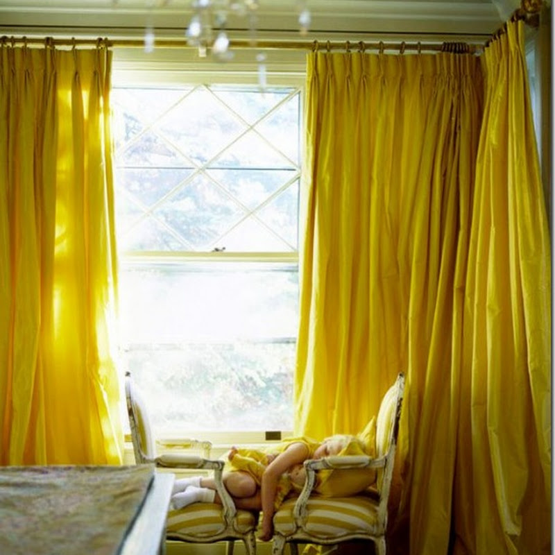
Amanda Prior via
Desire to Inspire
House Beautiful March 2008 - just had to post this photo one more time

Image via
PointClickHome - love this butler pantry

Living etc. September 2007 - I really like this idea

 Southern Accents, designer Suzanne Kasler, photography by Trio Giovan
 Southern Accents, designer Jenny Peters, photography by Tria Giovan
 D Home, designer Julio Quinones - love the bench & cafe table in this kitchen
 image via Desire to Inspire
  Image via Cottage Living
 Amanda Prior via Desire to Inspire
 House Beautiful March 2008 - just had to post this photo one more time
 Image via PointClickHome - love this butler pantry
 Living etc. September 2007 - I really like this idea
.jpg)

.jpg)


.png)


.jpg)


10 comments:
That is just the most gorgeous tone of blue in the first photo.....just lovely !
Who needs food when you have a kitchen like those.
All really sparkly, white and right.
Love that first one too.
While the design by Jenny Peter's is so clean, so Italian and perfect, I wonder about all that wasted shelf space.Where are the real utensils needed for making a great meal? How about a stack of plates to eat of?
Great selection of photos! I really like the mint green French doors in one of the photos. That last photo - Brocade Home offers a shadowboxed frame very similar to it.
Karen
Oh these first 2 kitchens are lovely lovely lovely:-)
lovely!
L-O-V-E that Susanne Kasler kitchen. Have you seen the rest of that showhouse? Ah-mazing.
Oh these kitchens are just de-lish! I gasped at the first photo.
I love the first kitchen too. Homer's odd - I think Jenny Peter's kitchen is lovely but I know what you mean - if it was mine it would definitely not look as pristine. Jenny - I'll have to check out that showhouse. Thanks for all the comments everyone and Alkemie for the tip about the frame!
All great shots! I really like the one from Southern Accents and the House Beautiful one from last month. Yum.
First of all, so glad I found your site via PVE! I'm adding you to my list of dandy daily reads...
The brick: white is your best bet if you would like a clean, neutral and seamless visual grouping, which will make your desk pop as a nice focal point. Also, the white will unify the brick and shelves therefore making that wall seem more expanded and less "choppy".
Chocolate will cause a visual separation from your great shelves, making the wall seem more "broken up". I'm a big believer in visually expanding a space with creams and whites then adding punches of color and fun with personal accessories and art.
For what it's worth, there's my two cents. Post pics when you're done! :-)
Post a Comment