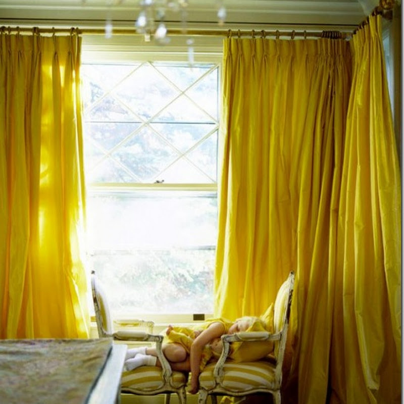
 Renée Finberg recently posted on Madeline Stuart Interiors and she aptly named it In the Category of Perfection. Here's the first image - doesn't get better than this. For more of her post head here - it's all gorgeous.
Subscribe to:
Post Comments (Atom)

.jpg)

.jpg)


.png)


.jpg)


17 comments:
Gorgeous. Hugs, Marty
Oh my word- she's a pretty sink indeed!
Adore this! I will check out more, it is perfect!
Xoxo
Karena
Art by Karena
seriously loving.
smiles.
michele
That sink is striking...I even love the soap!
I love that...very old world! Gorgeous stone sink, cool mirror and lovely plaster (faux painted?) walls. Have a great weekend, Michele!
Loi
I have never seen anything more beautiful, Michele! LOVE it!
Teresa
xoxo
This is a nice sink!
beautiful indeed! have a great weekend!
Nancy
Powellbrowerhome.com
Went to visit, I love her use of black in the rooms.
I've always loved that bathroom. She is an incredible designer.
A sink carved out of a bar of soap...that is what it brings to mind!
Love Renee, BTW!
The sink’s slim design is very eye-catching. It must be quite alluring to have a sink this gorgeous. Adding aromatic scents will make this area’s ambiance very soothing. And oh, the faucet and its handles amazingly matched with the design, simply elegant!
Darryl Iorio
The walls and accessories used accentuate the sink, and that’s the most impressive part to me. It’s amazing that such simple materials can enhance the beauty of the sink, from good to extremely awesome. I wish to see the whole area. I bet there is more impressive stuff to be seen in this room.
Carmella Vancil
Carmella was right about the accents used. They are impressive. The sink itself was very simple, yet the look was balanced. The colors and designs of the background and accessories simply complement and not outshine the sink. What else could be a better name for this but “perfection!”
Bibi Karpel
This sink is a testament to “There’s beauty in simplicity”, agree? What caught my attention the most was the faucet handles! I’m not sure if it’s vintage or what, but I am very sure that it’s uniquely wonderful. I bet there’s more yet to see in the whole bathroom. Maybe you can post the entire area as well.
-Althea Tumlin
I agree with Carmella. You don’t have to put so much detail into it. For as long you have fixtures that will match perfectly with the sink, it’s going to be a stunning one.
Javier Hallum
Post a Comment