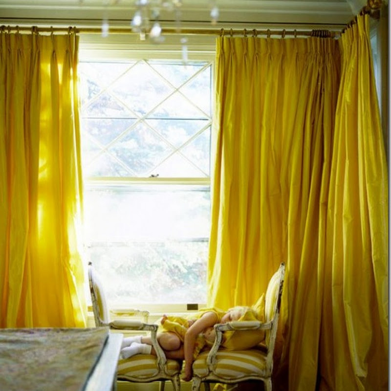
Last week I finished reading Asa Larsson's most recent novel translated into English, which then got me searching around the internet for some of the Swedish cultural references in the book. This led to finding designer
Marie Olsson Nylander's home, originally featured in the Swedish magazine
Residence. It turns out this creative, colorful home was covered by numerous blogs
last January but I'm only just finding it now. Wish I knew the name of the photographer - isn't this first image with the edge of the green pot in the foreground genius?


I think interior design in 2012 is going to feature alot more color. What do you think?
 Last week I finished reading Asa Larsson's most recent novel translated into English, which then got me searching around the internet for some of the Swedish cultural references in the book. This led to finding designer Marie Olsson Nylander's home, originally featured in the Swedish magazine Residence. It turns out this creative, colorful home was covered by numerous blogs last January but I'm only just finding it now. Wish I knew the name of the photographer - isn't this first image with the edge of the green pot in the foreground genius?
 I think interior design in 2012 is going to feature alot more color. What do you think?

.jpg)

.jpg)


.png)


.jpg)


15 comments:
I love how airy this place looks! :)
p.s. thanks so much for visiting my blog!
I totally agree. Did you see the cover of Veranda? Gorgeous clear color, not an overdose, but in upholstery and art. Here's to more color in 2012!
Love this home - I especially like that blue drawer chest = what is it? Great inspiration. Yes indeed home posts are fun.
Yes, I think a little less muted, gray French stuff is in order. The colors are certainly happy looking without being obnoxious.
Love anything aqua! First photo is awesome.
I think color is IT for 2012!
Enough of the white. It looks fresh and clean, but is getting boring and very unrealistic unless you love to clean.
Great house. I believe the photographer is Sara Svenningrud.
We can only hope some of the white rooms will slowly start adding pops of color and texture! I look forward to more creatively bold design choices this year!
I do adore color against white walls like that. the photo of the dining room in that house has always been a favorite of mine. what a wonderful mix of items and textures. happy new year, michelle. donna
I hope so, cos I'm remodeling my new flat and it's going to be very colourful!
Dahhhling if it's any consolation it is the first time I have seen these images or heard of the designer so to me it's new!
FAB rooms!
This is fabulous!
já vi várias fotos desta casa e acho-a sempre fascinante!
Airy and cool building. presenting modern style of construction.makeup artist
We can only hope some of the white rooms will slowly start adding pops of color and texture! I look forward to more creatively bold design choices this year!online makeup class
Post a Comment